-
Recent Posts
-
Archives
-
Categories
-
Meta
Framing tomorrow
November 22, 2012 – 9:55 pm
Shrine (II)
November 22, 2012 – 9:48 pm
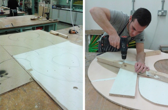
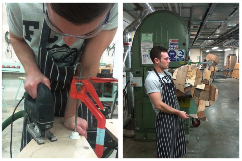
After a shitty visit to a landfill site (not really) with lots of walking and no proper research (it got dark, it rained and we never got even close to the actual landfill site) we decided to start making our final piece today.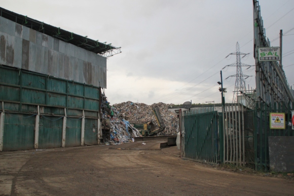
We got slayed at the crit so we decided to get started with the massive chicken in the workshop. We didn’t know that we were expected to be so further down our project by now, so we thought we might have to get moving quick. Once again it was a fun, long and productive day in the workshop.
Our plan is to finalise it and photograph it by next week. We’ve already gathered some stuff to cover the bottom wood layer with but have to sort out how we are going to stick it and the look we want to give it.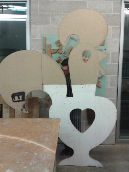
Cartier-Bresson: A question of colour
November 14, 2012 – 11:04 pm
Running until the 27th January 2013, this exhibition tribute to legendary French photographer Henri-Cartier Bresson aims to question the medium of photography and its development throughout the years.
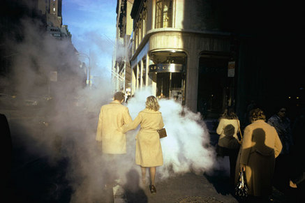
Untitled, New York Joel Meyerowitz
At the core of the exhibition lies a fundamental question with no apparent answer: black and white or colour art photography? It is obvious by seeing Cartier-Bresson’s body of work what his answer was. The exhibition points out really cleverly the French master’s opposition to colour photography by showcasing the work of important modern photographers influenced by him. Joel Meyerowitz, Karl Baden or Fred Herzog feature in this elaborate list of artists that have adopted Cartier-Bresson’s “decisive moment” and taken it into another level –colour.
“Life is once and forever” – Henri Cartier-Bresson
The French photographer’s ethos elevates every single second of life to celestial status. “Life is constant flux” he says. “and every moment happens just once”. In his photography we can see that. He captures fugacity and has created a legacy of photographers that do the same. Whether it is in the streets of New York, Sydney or the slums in India, this idea of everything coming into place in the photographer’s canvas is what weaves the thread through this exhibition.
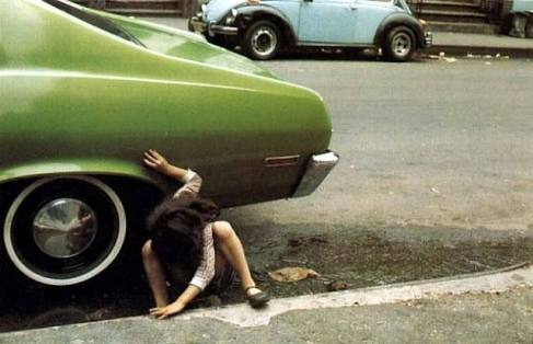
Girl crouching next to green car, New York (1980) Helen Levitt
Cartier-Bresson’s black and white photos are displayed thoughtfully in between the rest of the works all through the four rooms that make up the exhibition. This gives the show sense and rhythm despite the notable difference in the medium.
“When you are yourself, that’s when the most powerful images come out” – Henri Cartier-Bresson
It’s like a temporary void full of instants. The pictures show the beauty of everyday life through the eyes of the sixteen photographers and this allows me to make my way through the gallery easily. In this exhibition it’s a matter of seeing what another one has seen on a situation where you could have been. That’s the beauty of photography. It’s a matter of merging the eye with the lens, not trying to prove a point but responding to the outside stimulus by letting your vision and subconscious flow. Who cares if it’s in black and white or colour.
Untitled Henri Cartier-Bresson
Shrine (I)
November 14, 2012 – 7:28 pm
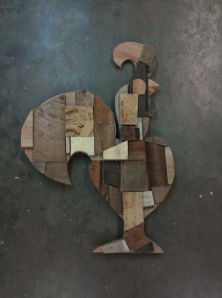
George and I met yesterday to get ourselves going with the Shrine project. We started off by looking up landfill sites that we could go and visit but we somehow couldn’t find one. After the bad start we decided to go to the workshop and get some work done. We had in mind producing a Nando’s logo with scrap found bits of wood as part of our research.
It came out better than we expected. We decided to use different bits of wood to give it a rough look and this way relate it to my passion -finding and reusing stuff from the street- whilst at the same time recreating the Nando’s logo. All through the day we talked how nice it would look big scale and we are planning on doing this.
It was a nice productive day in the workshop -where I hadn’t worked before- and we’re looking forward to developing this concept further.
Photoshop spread
November 11, 2012 – 2:05 pm
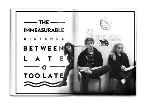
Richard and I found a common characteristic between both of us with the help of Rosa and it’s that we’re always late -Richard more than me though. For this day project we decided to expose our flaws on a double page spread. It’s funny because we had a completely different idea in mind until we spoke with Rosa, who told us we should do something related to lateness.
What I’m passionate about
November 9, 2012 – 1:44 pm
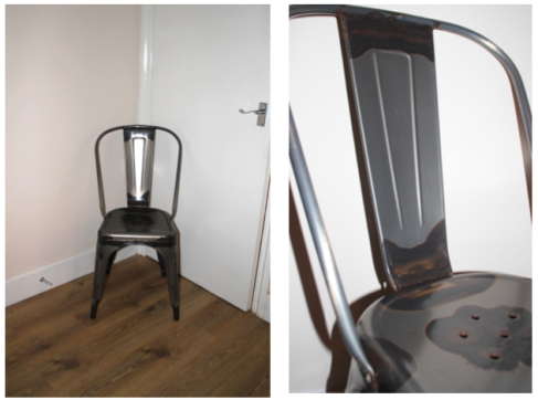
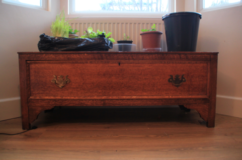
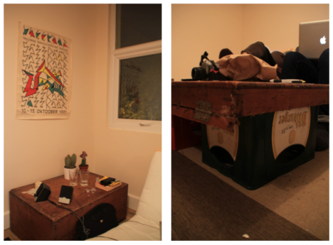
Finding stuff on the street and giving it a use in my place. That’s what I’m passionate about. It all started with an unfurnished house a month ago and our collection has been growing. We’ve gathered from chairs to amazingly beautiful drawers. I’d like to encourage people to do this sort of thing as it’s cheaper, much more mind-estimulating and fun than buying furniture.
We are now on the second part of this project where I’m working with George Farrell. We have to produce a shrine combining both mine and his passion: finding stuff on the street and Nando’s.
Logo project
November 5, 2012 – 12:32 am
For the logo project we were given a grade according to the marking criteria scheme used to evaluate all of our projects. I was assigned grade C.
For the first 100 logos we had to do, I represented it too abstractly and it wasn’t communicating properly. At first I didn’t think the aim was to get inmediately once seeing the symbol that it was a grade C, so I went with the concept of balance and composition. I was told that the idea of balance could be a starting point to develop but I struggled with this. Also, I realised through the crits that the aim of the project was to produce a symbol more than a logo. I believe the first one is meant to get the message through straight away and the second one isn’t. A logo can have a concept behind it but not necessarily has to be as explicit when getting the message through as a symbol -like the Shell logo for example.
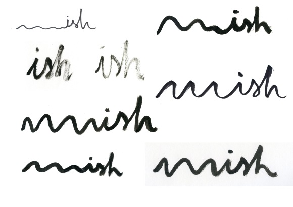
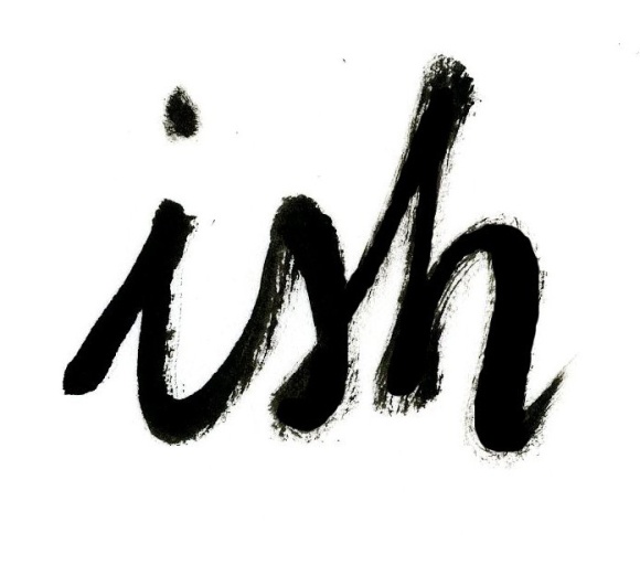
I tried stuff out to expand the idea of balance but didn’t really know how to represent it. I thought about contraries but I didn’t engage with this idea. Plus, I found representing contraries with imagery really hard without being really suggestive. After realising that this concept wasn’t taking me anywhere -I got really stuck with this- I decided to take a new direction and brainstormed possible words that could represent the idea of averageness or mediocrity, which is what grade C inspires me. This idea of being in the middle, being able to go up but down at the same time. I thought words would be a lot more powerful in my logo than images. I came up with different words like “mild”, “shelter” or “ish”. I tried them out through different mediums and black ink seemed to be the most appropriate. The imperfection of its look made it C-like and I found it beautiful as well.
In the end it was “ish” the most successful one. I think it represents in a familiar and catchy way this idea of missing something to hit the target fully, of not being quite right but not wrong either. We thought that the word in its own without the tail worked better as it was more concise and straight to the point. It worked better in small than big because it was originally small and I had to blow it up. Overall I’m happy with the outcome even though I didn’t follow throughout the project as well as I would’ve liked to.
Tony’s Cafe
November 4, 2012 – 4:19 pm
Go there and inspire us. This was the brief that we were given for this project. We were assigned an area around Pimlico and had to present anything inspiring we wanted two days after. I worked with Ben, Lily and Sophie.
The first thing we did was go for a walk around our area. At first, the only apparent highlight was one of the tallest buildings in Pimlico called Hide Tower (irony) which I liked but they didn’t really. The weather wasn’t helping either so we wanted to go and refuge in Pret a Manger and talk about what we should do. On our way there, we stumbled upon a little gem. Its name is Tony’s Cafe and it’s an old italian cafe different from anything around the area. Its warmness and appeal drew us to film a small documentary on it -and enjoy a nice breakfast there as well. What I like the most about this project is how randomly we came up with the idea behind it. It’s a clear example of how inspiration can come from anywhere everyday.
<p><a href=”http://vimeo.com/51106772″>Tony’s</a> from <a href=”http://vimeo.com/benbrookes”>ben brookes</a> on <a href=”http://vimeo.com”>Vimeo</a>.</p>Piss off paper
November 4, 2012 – 3:08 pm
I’m really far behind with my blog so I thought I might want to catch up by reflecting on some of the projects we’ve done until the day.
This one day project was really entertaining. We were given a big piece of paper and were told to bring in black pens and scissors -which would later be the only materials we could use. We were split into groups with the only request of having to interact with people with our piece of paper. I like the fact of being given few materials to work with. It’s then when creativity can flourish in a way that it normally doesn’t. Plus I think that in a world of excess it’s beautiful to use really basic materials to make it work.
I was grouped with Hannah, Rachel and Ken. As soon as I saw the big piece of paper I associated it with the typical film scene where you see two workers carrying a big piece of glass and are in the middle of the main character’s way. So we thought about doing something with that and annoying people with a simple piece of paper. It wasn’t much later that we came up with the mostappropriate name “Piss off paper”. The name was the click that made us get hands on with it.
We decided not to modify our given materials, just move around the white piece of paper. This way the plainness and innocence of the piece of paper was accentuated. What harm can a white piece of paper do? That’s what we wanted to try out and play with.
We thought what area of London would be the most crowded to annoy people with our piece of paper. Oxford Circus was our destination. First, Ken and I moved around with the paper. We swapped with Rachel and Hannah later -I must say they were a lot braver and aggressive than us. We were surprised by the wide range of responses. Some people had fun with it, even danced around it and smiled, whilst others broke through it or swore at the paper in an East-european language that none of us identified. At the end of the day we put together a short film with the best reactions that we’d documented.
